LO1: Be able to create a proposal with sample materials for an original media product to a client brief.
LO1 Proposal (pass and merit)
Purpose, Form and Genre:
The purpose of my magazine, "TEMPO", is mainly to entertain and inform consumers. In terms of form, my magazine will be relatively global, as it will target fans of the game from what the magazine is based on. In terms of genre, my magazine will be a mix of themes: music, gaming (rhythm games). The overall aim of this magazine is to appeal to fans of rhythm games (more specifically, it targets fans of the game Friday Night Funkin') as the entire magazine will be rhythm game themed. Because of the popularity Friday Night Funkin' gained over the last few years, I believe that having the magazine based off this game would attract many fans and may even spark interest in video game fans that play games outside of rhythm games. Because of its appeal to younger people, the magazine will mostly target young teenagers to young adults. Due to the magazine targeting younger people, the social grade that I believe fits the audience requirements the most is C2 - D because they would have more time to play rhythm games and read a rhythm game based magazine in general. The front cover will have an image of a popular fan-made character as the main image a long with a fitting background and other special effects that will attract the target audience. The fanbase for the rhythm game Friday Night Funkin' has gained popularity over the years by fan creations and mods: this is important to consider, as I should ensure that having these fan made creations alongside official work are included to show how the magazine is directed specifically towards FNF fans. By having a fan-made character as the model on the front of the magazine, it will show the audience the inclusiveness of content and how niche the magazine may be in comparison to other rhythm game magazines (and magazines in general). Following on from the music genre, my magazine will also briefly go over songs that are related to rhythm games, for example, future songs to be added, songs that can be purchased etc.
My magazine front cover will feature the fictional character Garcello as the main image for the front cover and will also be apart of the theme of my magazine. The main theme of my magazine will be a video game mod called: Friday Night Funkin, - Smoke em' Out Struggle. Because this mod contains themes related to smoking and back alley ways, I will incorporate this into the magazine's appearance. The main cover line will be "Street Light Haze" and the articles at the front of the page will be related to the creation of the mod 'Smoke em' Out Struggle'. I would like the magazine to have cartoony elements embedded in it as well as parts of realism, so to accomplish this I will draw the fictional character wearing street fashion (to fit the theme of the magazine) and use a photograph of a dark alleyway for the background.

I plan to do this as it will be inclusive of all genres and rhythm games so that it can reach a slightly wider target audience. Despite the main theme being extremely specific (fan-made character from specific genre and rhythm game), including other rhythm games will show inclusive the magazine is as a whole. While featuring content for rhythm games besides FNF, this will broaden the target audience requirements in terms of social grade. I believe that this will still include people within C2 - D, but may also attract C1 depending on their interests and the free time they have.
Proposed content:
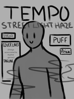
In terms of layout conventions, I created a sketch / diagram of where I roughly plan to place the layout conventions, such as puff, price, body, margins, barcode, headlines, etc.
I decided to keep the diagram rough and un-detailed so that I can go back and add adjustments after and during the creation of the front cover / contents page / double page spread where necessary. On the sketch for the front cover, I included the masthead, name of magazine, puff, price, barcode, tagline, and a brief sketch of where the model will be on the page and how much space it will cover up. I decided to display this layout by using a digital art program as it allows me to edit, hide and move layers accordingly and make adjustments where its needed. I created two other rough sketches of layouts to plan the contents page and double page spread that both had a similar style to the front cover sketch and both included similar conventions.
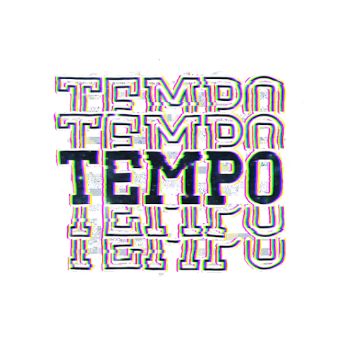
In terms of finalising the designs, I had created the masthead and main image before starting to make the magazine pages so that the designs would be ready to use whenever I was ready to start designing. The masthead, TEMPO, will be used in the background of any TEMPO produced magazines. The font I used for the masthead is called Dezire Stacked, that has a multiplying text effect in the background that makes the text appear stacked on each other. I chose to use this font instead of the other choices I had as I believe that I would have a lot of creative freedom editing this font because of how unique it is to itself. I also believe that with the text stacking effect, masking the model above the text would be further emphasised and will be blended into the background to make it appear more dramatic. To follow on from the VHS theme, I decided to add static, glitch, and other effects to achieve this theme.
My magazine is going to follow the conventional layout of a classic magazine (masthead, title, headlines, deals, prices, barcode etc.). The front cover will have the TEMPO masthead at top masked out in the background with the model in front of it. The masthead, as shown below, has a glitch effect and several other effects to achieve the VHS aesthetic overall. I also used a lot of masking to get the starry effect inside the main text. I did this to make the magazine look unique and recognisable from afar. With the design choices I have made, I believe that my magazine will appear more niche and underground than others while still following the main conventions of a traditional magazine. Once imported into photoshop, I will add a drop shadow to make the masthead stand out and appear more 3D. I edited the text (including effects and masking) on a mobile app called Alight Motion, that can be used for both photo and video editing. I decided to use this program as it is easy to understand and use without complications and it allows a lot of creative freedom when it comes to editing. The app uses similar effects and features to Photoshop and After effects without being too overcomplicated or confusing for the user. Once I had done fully editing and finalising the masthead, I exported it as a PNG image (for a transparent background to make masking easier on photoshop) and imported it into Photoshop for all of the magazine components and conventions to be put together.
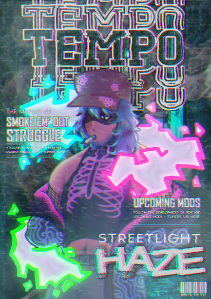
The main headline will be on the left, as it is in the direction of where the character / model is facing towards. I believe that the main headline will be effective on this side more than the other as it will make the character seem more lively and real as if it is interacting with the magazine itself. As well as this, the main intention with the smoke cloud was to provide room for the headlines and other content to be included: I thought by including the coloured smoke, it would stick with the main theme while also providing support for the text to be easily read without having to add any intense drop shadows and effects. As well as this, I decided to include the smoke clouds in general because of the character on the main image being known for and having an association with smoking and having a cigarette that produces smoke in different colours. Including the smoke itself would make the magazine recognisable to fans. Because I included the smoke clouds, I decided to add the cigarette in the drawing to make the smoke make sense to people that have never seen the character before. In terms of the text itself, I used a variety of similar effects used to create the masthead. As mentioned earlier, the program used to create the masthead was Alight Motion: However, I edited the text on Photoshop due to its similarity to Alight Motion. I knew that I would be able to accomplish a similar finish to the text and headlines on Photoshop to Alight Motion. Again, to follow the VHS theme, I used static and RGB split effects to make it appear like an old recording. To further emphasize the glitch effects, I used the tools provided on Photoshop to add streaks and move parts of the text accordingly to look displaced and lagging.
I decided to not do a photoshoot for this magazine, as I thought that it would appeal more to the target audience if the main image was digitally drawn and cartoonish rather than finer and realistic. In terms of character design, I remotely tried my best to keep it similar to his original design created by the author. The character has its own traits and trademarks that make him distinguishable compared to any other characters, for example: the unique hat, teal hair, and coloured smoke clouds etc, and I tried my best to keep these unique characteristics without making any drastic changes. Due to his original design being simplistic, I decided to only add things that would make his appearance appear more complicated rather than simplistic. This way, I would attract a wider audience with the mix of a realistic appearance and a cartoony art style. The main and most drastic change I made was the character's outfit. In his original source, he only wore a jacket and t-shirt a long with fingerless gloves. Overall, his original design was not overcomplicated or sophisticated, so the only changes I made were giving him a sleeveless turtleneck shirt with a ribcage (as a reference to his media. His lungs and ribcage glow with smoke at some point in his media and it is noticeable to viewers. People who purchase this magazine will be able to make the connection from the ribcage to what happens in his media). I decided to add bright blue smoke swirls and patterns to his jacket sleeves to make it appear more neon and bright. I also added neon pink patches to the inside of his jacket that is revealed to emphasize the neon effect. Some minor details and changes I decided to include were the flower patterns on his hat: I did this to again, further emphasize the neon effects. The reason I decided to include a vast range of neon patterns was to make the neon glowing smoke clouds appear as more of theme rather than just a character trademark: The entire magazine will be filled with neon and bright shining colours to make it appear niche, unique, and easily identifiable.
Original character design, along with coloured smoke:
Final front cover design, along with main image and character design:
In terms of the background, I plan to use an image of an alleyway found from Pinterest. I chose this background for several reasons. One of these reasons is because of the lighting in the image: I was immediately drawn by the bright blue lighting emitted from the lanterns shown. I liked the atmosphere being portrayed by the lighting in a dark setting. I believe that a dark background with bright lighting would be fitting for the theme I am going for (especially with the shading on the drawing being relatively dark with only the smoke being used as the main source of lighting). Because I wanted the smoke to be the main source of lighting, I edited the background to look even darker by lowering the exposure and shifting the hue to a more turquoise colour. in general, I am not very fussed about the appearance of the background, as a vast majority of it will be covered up with smoke overlays on different blending modes: The background is merely there to provide an atmosphere and dark neon setting for the magazine.
The main reason why I chose this background is because of the connection I believe it has to the media in which the character from the main image is from. The character is mainly seen in a dark alleyway at night surrounded by street lamps, where other characters are drawn to him due to the lighting from the smoke. I believe that if the target audience were to see the main image on this background, they would be able to recognise the media from what its from and make it more identifiable. In the end, I decided to use this background as it is more realistic and was taken in real life, whereas the alleyway that comes from its original media is digitally drawn and not as detailed as the characters are more focussed on rather than the background. In general, I believe that having a dark alleyway filled with neon lights would look aesthetically pleasing following the VHS theme and glitch / warp effects.
Original background, digitally drawn by author:


Comments
Post a Comment