Codes and Conventions of a magazine:
In this report, I will be discussing the codes of conventions of industry magazines. My magazine, Streetlight Haze, including all of its features and assets follows the main conventions of traditional magazines while still coming across as niche and unique. The repetition and difference genre theory, created by Steve Neale in 1988 has links to magazine conventions. His theory states that all genres all contain instances of repetition and difference, difference is essential the economy of the genre. In relation to this theory, my magazine follows the same conventions of video game and music magazines that already exist: However, tp[his time, I am creating my magazine based on a rhythm game that has not been done before.


Front cover:
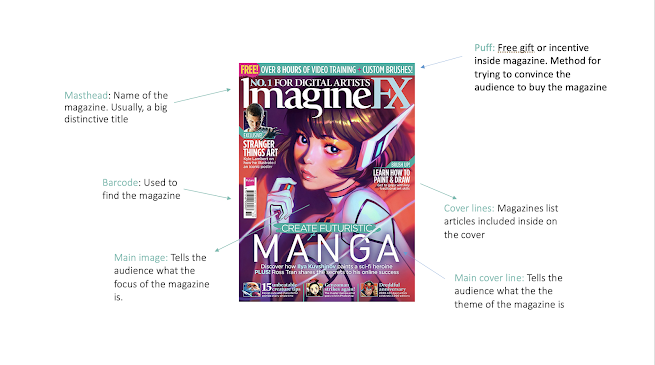
I decided to use this magazine as a base to my magazine, and frequently used it as a reference when it came to the production of my front cover. I chose this magazine out of the many examples i could've used because this magazine matched the most with the theme of my magazine. I believed that this was a good layout and example to follow, as ImagineFX is a well known magazine company among traditional and digital artists.
The layout of my front cover is very similar and almost matches the layout of this front cover - I followed the recurring theme of mastheads at the top of front covers (usually seen on most magazines), but I slightly changed the appearance by masking the text and putting it behind the main image for a 3D effect. I did this because of how large the font is and the repeating effect it has.
I copied the placement of the cover lines on the ImagineFX front cover, by placing the first cover line on the left hand side towards the top. I did this to make it the most noticeable cover line as it is the main cover line. Again, referencing back to the ImagineFX magazine, I placed the next cover line slightly further down below on the right hand side. Alongside the cover lines, I added thin white and turquoise lines below and in between to underline and highlight the cover lines to make them stand out and be more noticeable. It also adds to the complication of the background, which is a theme I wanted to include in my magazine. Furthermore, the ImagineFX magazine front cover contains bold text highlighted above the cover lines saying "EXCLUSIVE!" and "BRUSH UP!", and the lines on my magazine follow a similar purpose - it highlights the cover lines.
Contents page:
Similarly to the front cover, I referred to a contents page from another magazine and used it as a base for the layout of my own contents page. By doing this, I am still following the conventions of an industry magazine, however this time it will be applied to the contents page section of the magazine.
The magazine I decided to use as an example of what the layout of what mine should look like was an image I found on Pinterest. I decided to look for the contents page and double page spread on Pinterest, as the images found on there give me inspiration for my own magazine. Because my magazine is quite visual with the recurring theme of cartoon characters and digital drawings, I wanted to choose a layout design that included an arranged space specifically for previewing images. This contents page was a good example, because of the neat arrangement of the images and the page label on each image that specifies which image applies to what page.
Again, using the contents page I found as a reference, I followed the general layout - I wrote table of contents on the left hand side, and rotated the text for an aesthetically pleasing effect. Because contents page contains more articles than the other contents page, I had to arrange the images differently and accordingly in a way that fits onto the page. With being able to arrange and edit images quite easily with Photoshop, I was luckily able to achieve this. Following the rest of the recurring patterns found on the original contents page, I included the article titles at the bottom half of the page and their page numbers.
Double page spread:


.png)

.png)


Comments
Post a Comment